Do you understand why this card is so hilarious?
Perverse appositeness, deadpan delivery and careless execution, it's intended for a pair from Boston. I'm imagining should anyone hear them reading it aloud cracking up. More.
Many more pop-up cards and their support pages here.
four ewes pop-up card
Labels: four ewes pop-up card, pop-up, pop-up card
pop-up card, sheep
Klang.
Etude. An attempt to get two central folds, which this does. The thing about this is, I had a paper towel tube smashed flat. Then smashed it again so the two folds lined up, one atop the other, which turned the tube with a round hole into a tube with a square hole. I noticed how it could go flat and imagined something glued to the side. Imagined a sheep. I'm not gonna use this particular card, but I will use the idea. This card just shows me how well or not the idea works. I learned anything standing up has to be short. The sheep need to be reworked, they're completely unsplendid. I go through a lot of card stock, reams of it with carefree undisciplined abandon.
Don't you hate it when your felt tips go dry? I had six of those things somewhere, now I'm down to one, and it's dry. That makes me insane, so out of insanity I bought a huge pack of them, there's like 24 in a box and two boxes taped together, and man, do they ever put out the black. I could completely cover a white card in black and not even think, "you should have used black stock."
party fish pop-up card
How this came about in 21 photographs and no words. Although, I suppose I should mention, those are my hands, photographed, printed, then photographed again in these pictures holding up the printed pictures of themselves. Very Escheresque over there.
The card features two tables, one of my favorite mechanisms. One table is one inch high and the other table is two inches high. In the world of pop-up making, that means one table must be within one inch from edge and the other table must be two inches from the edge, a precision easily enough arrived at by trimming. The two tables intersect and share a post on the card's spine, but not really because the posts are stacked. I'd rather deal with simply what fits within the card than measure things mathematically but it's good to to have an exact size for the posts. This card, if you analyze it, doesn't actually pop up, rather, the posts prevent the leaf from falling flat, forming a table, they simply elevate the leaf above its natural position. Three posts per table, all parallel, the center post along the spine. <--incomplete sentence, but I don't care. The posts are made first. Careful measurements and scoring required for all folds, but oddly, not for cuts. Get all that out of the way right off because the work space gets a bit messy after that. Construction-wise, it all gets down to making the posts exactly.
Many more pop-up cards and their support pages here.
Labels: party fish pop-up card, pop-up, pop-up card
ninja
Pole with poo extends.
There's also poo fighting sticks but those are kept in a coffee can outside the doorway as they must be refreshed daily and so are not suitable to hang on the wall.
Clackers
Wrist Rocket
Lawn Darts
Coke with Mentos, you know, the usual accoutrement.
stiltz
Walk'n on hamburgers.
I play pocket pool
Walk'n on hamburgers.
I play pocket pool
Walk'n on hamburgers.
Gaston thought hamburger stilts was a good idea for the squishy extra cushion they provide, but it didn't last.
Lawn Jockey
I love these things. They're so gracious, "The driveway is right here, Sir.", "Mind the gap", "Yo, Dog. Step." "No Sirs, do not approach the house today for we are being covered. Do hasten along, please, until you see one of us with our lamp lit, Godspeed, then. Cheers."
Why I love lawn jockeys so much, especially the black ones.
training film -- gore
Most stoic ex-vice prexident and failed presidential candidate ever.
Understand, dictators at heart seek dictation over things other than mere countries.
Dictation?
lily pond pop-up card
Inspired by a mechanism seen in Sabudo's interpretation of Wizard of Oz. It was one of the little ones that he sticks in the corners to fill out the story and fill up the empty areas of the main pop-ups with something puffy. The scarecrow, precisely. This is how most my cards come out -- a bit overdone. It would be a lot simpler if I'd stop getting carried away, but it always becomes apparent once you're into it how much a thing can be elaborated. And so more, and more, and more to the point where you can't get the thing shut or folded flat and then must fashion a box instead of an envelope. It's sort of come to characterize my style, if I have one, and I suppose an indication of immaturity. On the other hand, drawings never get beyond sketch form,
Many more pop-up cards and their support pages here.
Labels: lily pond pop-up card, pop-up, pop-up card
European mental map of U.S.A.
and I mean this in a good way,
it's how their socialist selves perforce perceive things
in order to make sense of the concrete world
when it comes crashing through their mental constructs.
Bless their hearts.

The mental map differs from an actual map but it's used to process something like Hurricane Katrina and the colossal failure of what is understood universally as a federal government's primary function, the tender over-care for the well-being of all its citizens no matter how complacent, uncooperative, or hostile those good and fine citizens be. [Understand, this is the Federal government and is in no wise the responsibility of State or City government, or in the case of Louisiana, Parish rather than District government. No coordination between levels of government is to be expected or even desired. Success or failure lies squarely with the federal government. Those other levels are not discussed, they're irrelevant, poorly understood, and tend to complicate.]
The yellow area up there ↑ is the mostly unexplored and undeveloped barren central region consisting mostly of vast areas of wispy buffalo grass or desert, identical to Australia's Outback except with Grand Canon instead of Uluṟu.
To be fair, Europeans know perfectly well there's a row of southern states between Texas and the Atlantic. Everyone knows that row begins with Louisiana and ends in Florida, and Florida looks like a penis. Ha ha ha ha ha .
Los Angeles and New York are the cities where all the people who count live but New Orleans, the Crescent City, is of special interest. Perfectly situated safely high atop a hill and occupying the whole of the Gulf Coast and encompassing the entire Mississippi Delta, it's surrounded by the waters of lake Pontchartrain, (named after Count Pontchar, who took up an interest in steam engines early on when the Spanish Mountaineers settled the place and named it after a town in Spain), the Gulf of Mexico and, of course, the Mississippi river which fans out after passing through the base of the great New Orleans mountain and spreading out as it flattens toward the great and tumultuous Gulf of Mexico, and which all together form natural and imposing protective barriers around the vast city on the hill. It's the ideal place for the U.S. government to round up all its minorities and herd them into one area, forcing them to live there through the century and a half following slavery, coerced against their individual wills, so they could be better monitored and altogether more thoroughly seen after.
ant birthday cake pop-up card
pop-up card
Featuring an underground world of ants.
Many more pop-up cards and their support pages at pop-up transition tank.
Labels: and cake pop-up card, pop-up, pop-up card
GIF transparancies
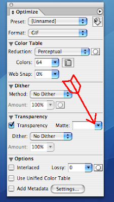
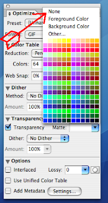
I discovered a little button in Image Ready that will make all the difference. Such a tiny thing that has a huge effect, makes you wonder why it's hidden. It has to do with the way .GIF files are optimized when saved. When the image is a transparancy, it's outlined as part of being saved. Like a cartoon. If you match the color of that inevitable outline to the color of the background the line effectively disappears. Imagine an actual transparancy outlined in white held over a white piece of paper. This outline messes up things royally when the transparancies are stacked in a table to animate at different speeds. I discovered IR, the new version anyway, gives you the choice of "none" in the place where you select matte color in the optimization palate.

Now let's see what sort of mischief we can
get up to.


